
Modern Bakery & Café Brand Identity
A warm, refined bakery and café identity built around quiet everyday rituals, tactile packaging, and soft editorial details.
Concept Project · Brand Identity · Packaging · Print · Social Media

Maison Lune is a modern bakery and café brand identity designed around warm everyday rituals. The visual system combines refined serif typography, soft neutral colors, subtle moon details, and tactile packaging to create a brand that feels calm, polished, and approachable.
Project Overview
The goal of this project was to create a complete visual identity system for a modern boutique bakery and café. Maison Lune needed to feel warm and refined without becoming overly luxurious, rustic, trendy, or decorative. The final system was designed to work across real business materials, including packaging, coffee cups, menus, business cards, labels, social media posts, and small printed details.
The Challenge
Many bakery and café brands can easily fall into familiar visual categories: too rustic, too generic, too sweet, too luxurious, or too visually crowded. Maison Lune needed to feel memorable and atmospheric while still being practical for everyday café use.
A key challenge was the moon motif. It needed to support the feeling of quiet rituals and warmth without making the brand feel mystical, gothic, or fantasy-driven.
The Goal
The design goal was to build a warm, refined, and approachable identity that could make simple café moments feel more thoughtful and slightly elevated.
The brand needed to feel beautiful enough for giftable packaging and social media, but clear and practical enough for menus, cups, labels, and daily customer touchpoints.
Audience & Strategy
Maison Lune was designed for young professionals, design-conscious café visitors, gift buyers, and lifestyle-oriented customers who value atmosphere, quality, and visual consistency.
The strategy focused on creating a brand that feels polished but not intimidating, soft but not childish, and elegant while still comfortable for everyday visits.
Visual Direction
The visual direction combines warm neutrals, soft blush tones, cocoa brown, subtle paper texture, and an editorial serif typography style. The system is calm and tactile, with enough detail to feel special but enough restraint to stay practical.
The moon mark appears as a quiet symbol of ritual and comfort rather than a decorative or mystical theme. Supporting details such as soft patterns, embossed textures, delicate borders, and label shapes were used sparingly to create consistency across applications.
Logo System
The logo system is built around a refined serif wordmark paired with a subtle crescent moon mark. Primary and secondary lockups were created for packaging, labels, cups, and printed materials, keeping the identity elegant and readable across both large and small applications.

Color & Typography
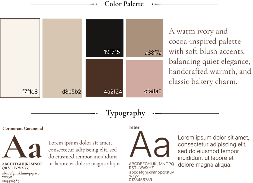
The color palette uses warm ivory, soft beige, dusty blush, cocoa brown, and soft black. These colors create a gentle café atmosphere while keeping the identity grounded and commercial.
Typography combines an elegant serif for the logo and headings with a clean sans-serif for menus, descriptions, labels, and body text. This pairing gives the brand an editorial feeling while preserving readability.
Graphic Elements
Supporting elements include subtle moon details, small star and dot accents, soft paper textures, restrained borders, and bakery label shapes. These details add warmth and recognition while keeping the system quiet, practical, and refined.

Brand Applications
The identity was applied across everyday café touchpoints, including cups, bakery boxes, gift bags, labels, menus, business cards, napkins, and social media.
Each application was designed to feel cohesive, practical, and quietly giftable, extending the same warm visual system across both physical and digital brand moments.


A flexible application system designed for café packaging, gifting, print materials, and everyday customer touchpoints.


Final Takeaway
Maison Lune shows how a small bakery and café brand can feel warm, refined, and emotionally inviting while still remaining commercially usable. The final identity balances atmosphere and practicality through consistent typography, soft color, tactile materials, and restrained visual details.