
Brand Identity · Graphic Design · Wix Website Design · Information Design

Guardian Shepherd — Brand & Web Design Case Study
Jo developed the brand identity, business card, information architecture, and responsive Wix website for this Virginia zoning and permit consulting business.

The Client / The Challenge
Guardian Shepherd helps homeowners and small businesses in Virginia understand zoning requirements, identify an appropriate approval path, and navigate applications and public review. The business draws on founder Mavis Stanfield’s experience in zoning and planning.
The design needed to communicate that experience in an approachable way. Category clarity was essential: the Shepherd concept had to read as part of a zoning consultancy, avoiding associations with pet care, security, law, real estate, or government.
Identity System
The primary lockup, horizontal version, compact mark, and monochrome treatment keep the same core elements recognizable in different formats. The horizontal lockup suits wide spaces such as the website header and business card; the compact mark retains the symbol when space is limited.

Brand Direction
Charcoal and muted green anchor the identity against light neutral backgrounds. The typography shown here pairs Cinzel headings with Montserrat supporting text. The delivered business card adds an orange-to-brick-red accent and uses Inter for contact details, adapting the core direction to a more compact format.

Logo Development
The client’s German Shepherd, Samson, provided the personal starting point. Selected explorations brought together three cues: the Shepherd for guidance, the G from Guardian, and a home for the property context.
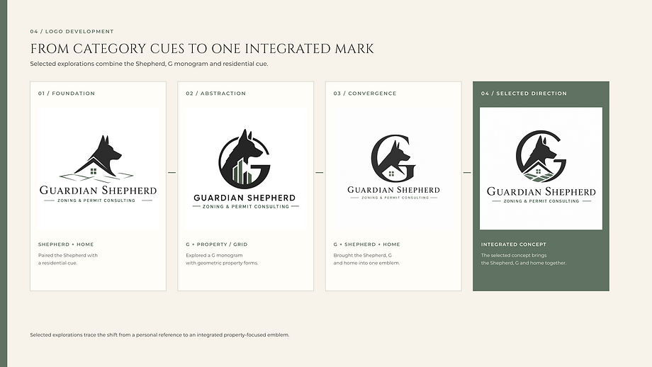
Client feedback placed greater emphasis on a recognizable residential feature alongside the G. The final direction integrates the Shepherd, letterform, and home into one emblem, preserving the personal connection while making the service context more visible.
Business Card / Print Application
The two-sided business card separates the brand introduction from the contact information. A prominent horizontal lockup leads one side; Mavis’s name, role, and contact details give the reverse a clear reading order. A supporting home motif extends the property cue into the layout.

Professional Document System
In 2026, Jo developed a three-page Client / Zoning Consultation Summary and a matching letterhead for this portfolio. These concepts were not part of the client commission; the documents use sample and placeholder content.

The summary moves from project context to review questions and conditional next steps. Repeated labels, status tables and checklists separate known information from items still to confirm. Numbered actions give the reader a sequence to follow, while the letterhead reserves an open area for correspondence.


Website Strategy / Information Architecture
Five pages give visitors distinct places to understand the offer, learn about the consultant, and begin an inquiry: Home, Services, About, How It Works, and Contact. A short service preview on Home leads to fuller explanations on Services.
The sitemap shown here was prepared in 2026 from the existing website for this case study.

Responsive Wix Website
The Home headline wraps into a taller composition on mobile, while the identity and service message remain recognizable. “Tell Us About Your Project” buttons repeat across the site, keeping the next step visible as visitors move from the introduction to the service and process pages.

How It Works explains four stages: Start a Conversation; Review the Situation; Confirm Fit and Scope; and Contract & Hourly Support. Scope and a contract come before billable work. The desktop overview uses four columns; on mobile, the stages form a vertical sequence.

About introduces Mavis’s zoning and planning experience. The Contact excerpts below show how name and contact fields change from a two-column desktop layout to a single column on mobile.

Outcome
The client project brought together the logo, two-sided business card and responsive Wix website. The emblem connects the Shepherd and G to a recognizable home, while the website takes visitors from service overviews to process details and an inquiry. The 2026 consultation-summary and letterhead concepts explore how the identity can organize longer documents.
